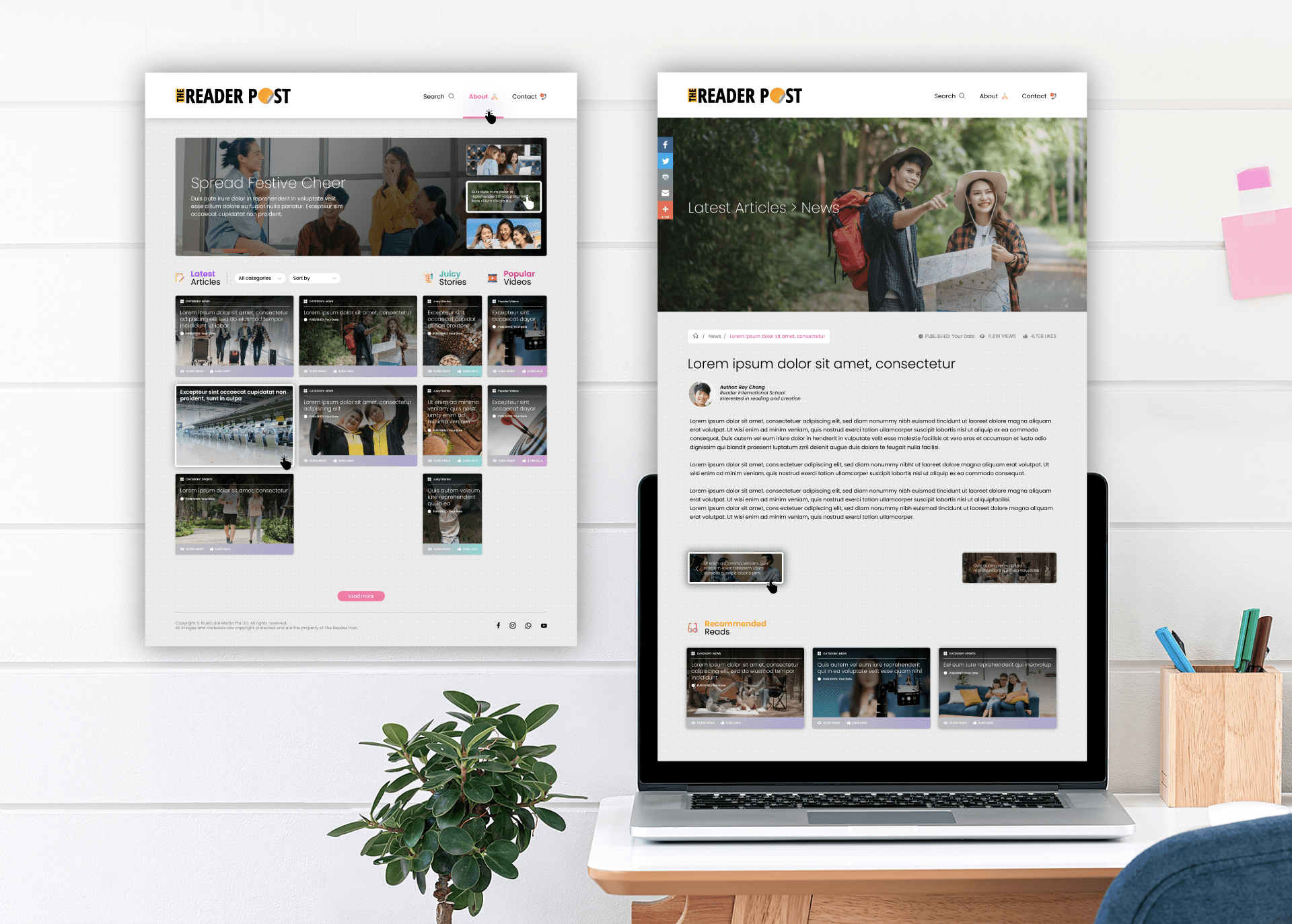
In this website design, the team experimented with different concepts of blog and news reporting, particularly aimed for student viewership.
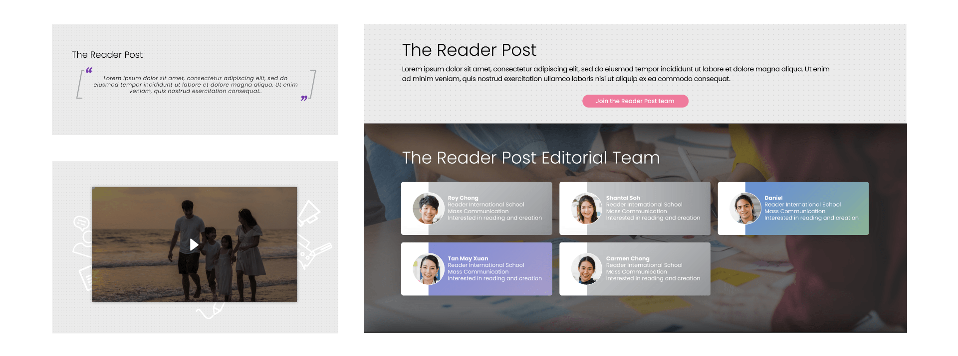
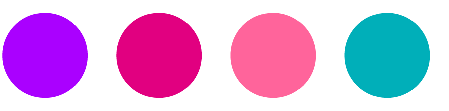
As seen in the homepage, the blog layout had evolved from an earlier concept of emulating “Post-Its” on a wall. Instead of a more generic layout, titles and content sections were linked together through the use of pastel colours.
Overall, the design elements were kept minimalistic, clean and neat to allow readers to easily identify categories based on their preference and focus their attention on the content.